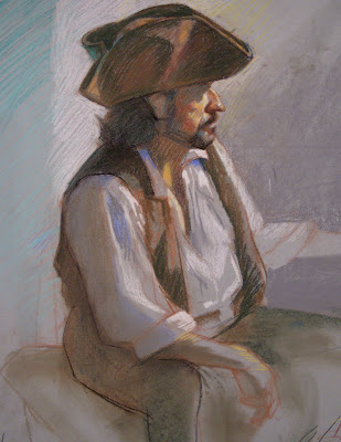
 Students are encouraged that their color drawing will only be as good as how you can differentiate light and shadow patterns in value only. Once the values are established, the logic of color principles can be applied. Saturation and Temperature. Pastels is all about layering. Unlike paint, you can't mix on your pallette. Most of the mixiing is done in layers of blending. The key of which is a base layer that is often neutral and pushed into the weave of the paper with a tortillion.
Tuesday, May 25, 2010
Close Up
 Students are encouraged that their color drawing will only be as good as how you can differentiate light and shadow patterns in value only. Once the values are established, the logic of color principles can be applied. Saturation and Temperature. Pastels is all about layering. Unlike paint, you can't mix on your pallette. Most of the mixiing is done in layers of blending. The key of which is a base layer that is often neutral and pushed into the weave of the paper with a tortillion.
Thursday, April 29, 2010
close up
Day 2 The POSTER
 I find that sometimes students rush their drawings to get "finished" in their minds as fast as possible. I can fall prey to this. Instead of using the basic tools presented we go on 'autopilot' and draw what we 'think' we know. We may get something that looks like 'a figure' but more than not it does not look like the figure we are drawing. I have to be vigilant and patient with the process. I specifically slowed down and did a minimal of value in this demo so that you can see how spending more time on one area, in this case the head, leads the way for the drawing to evolve naturally, instead of trying to do "everything at once".
Tuesday, April 27, 2010
The Value of a quick VALUE study
 Day 1 we focused on the block-in paying attention to the basic essence (balance, gesture and proportion) while also utilizing the shadow edge. Before that however, on the left side we did some 12 minute values sketches getting the basic key of the painting, that is understanding how dark the general light mass is and the general shadow mass. This is a way of visulaizing your final drawing and preparing yourself to dive into the richness of the tonal varieties without fear.
Wednesday, April 21, 2010
Subscribe to:
Posts (Atom)


